
TRUBAR:
Brand Guidelines
ART DIRECTION & GRAPHIC DESIGNYear
2025
Client
TRUBAR
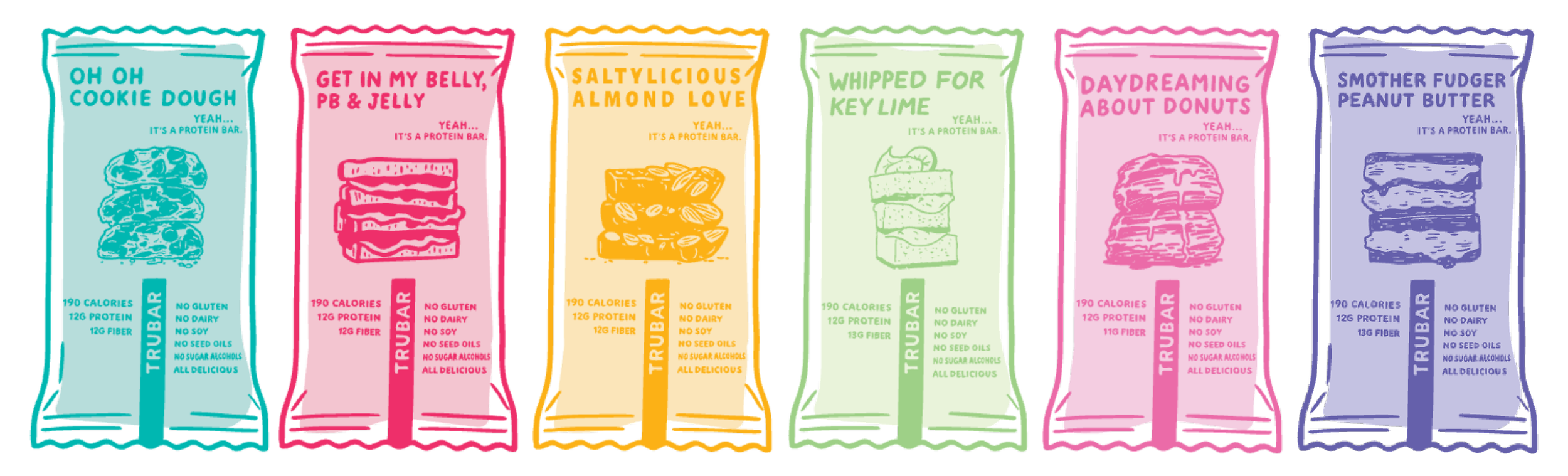
When TRUBAR first partnered with Acadia, their brand identity consisted of a wordmark logo, a limited color palette, and a handful of outdated visual look documents from previous years. With plenty of room to grow, we saw an opportunity to build upon what was already there and give the brand a more cohesive look and feel.
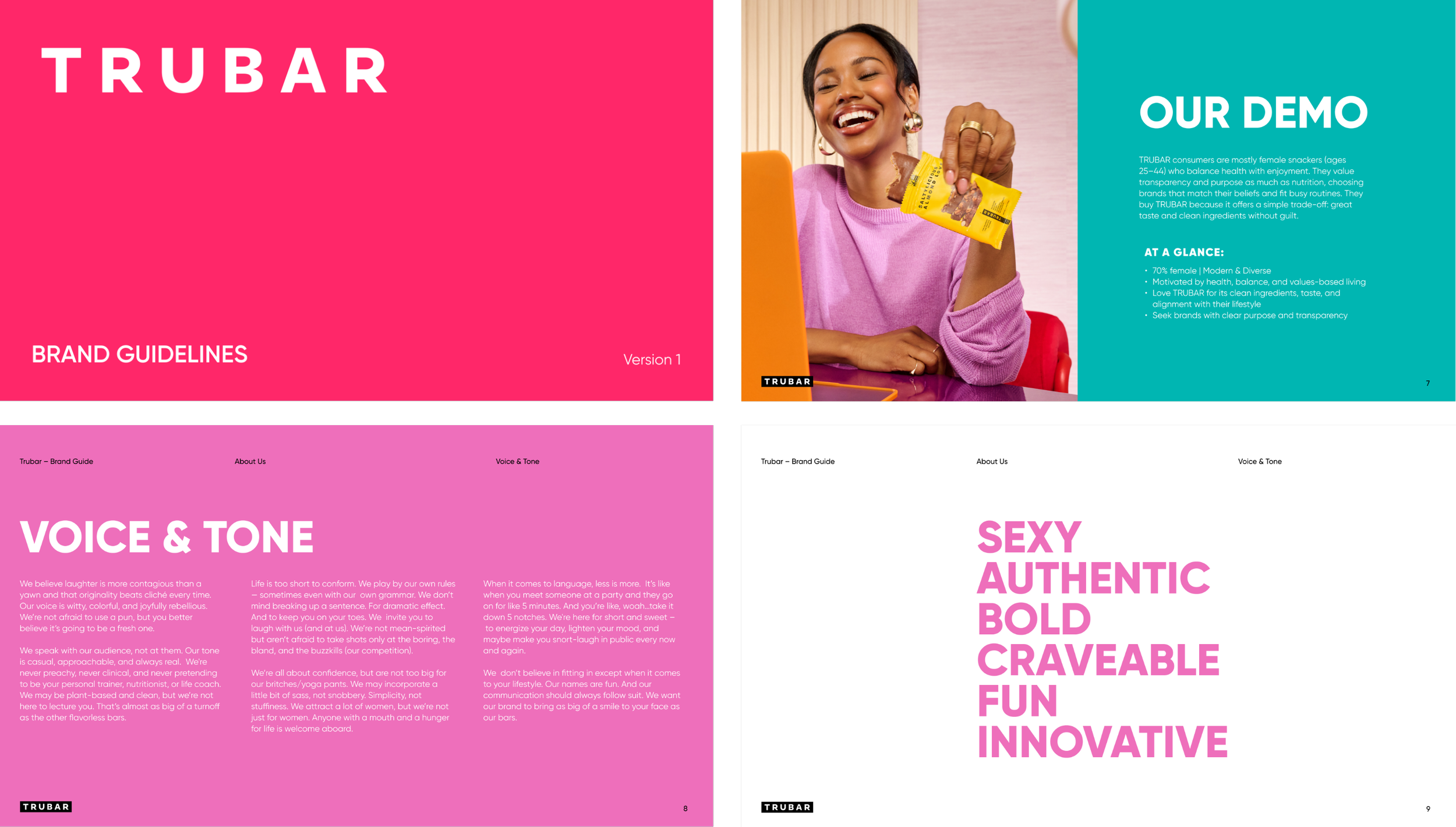
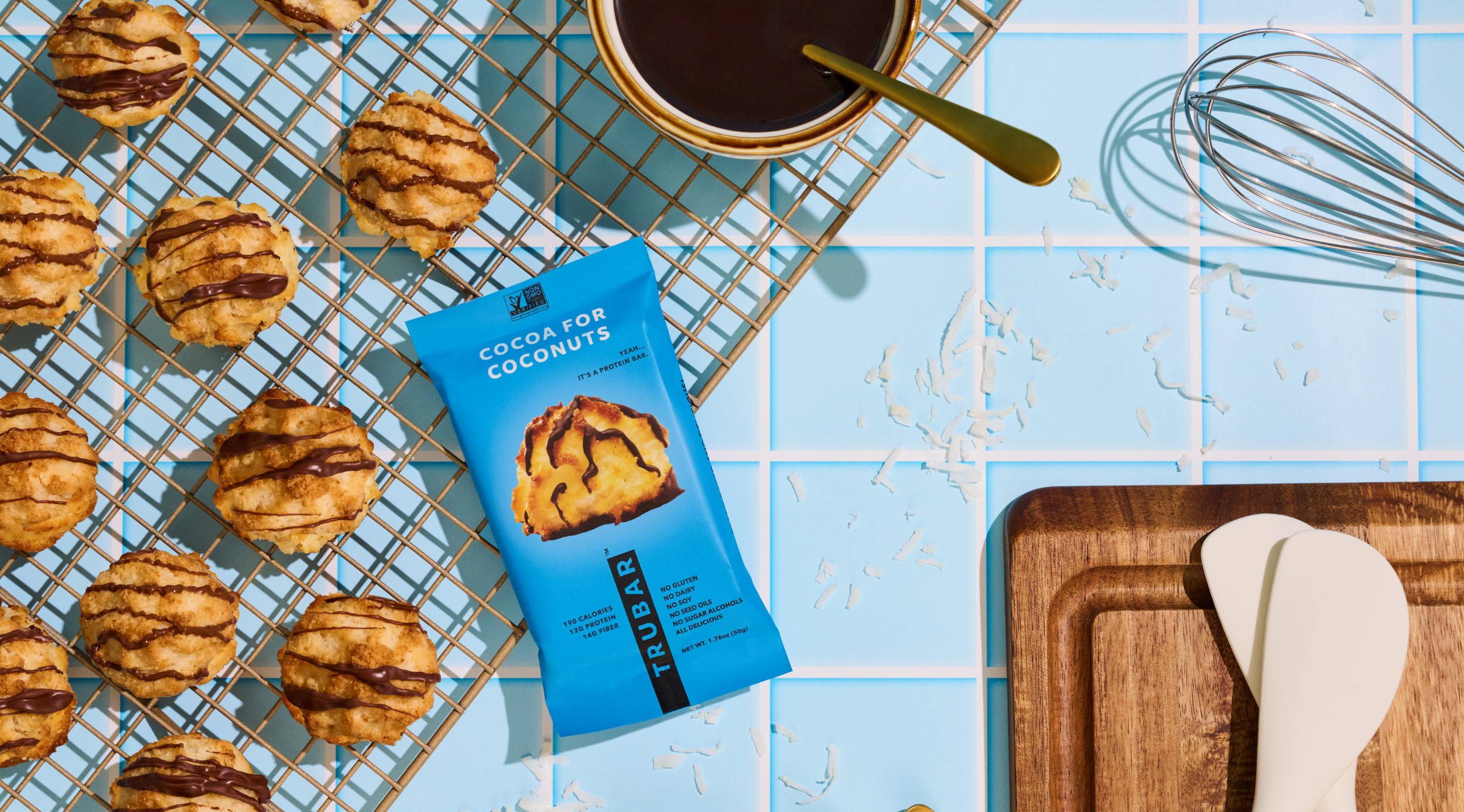
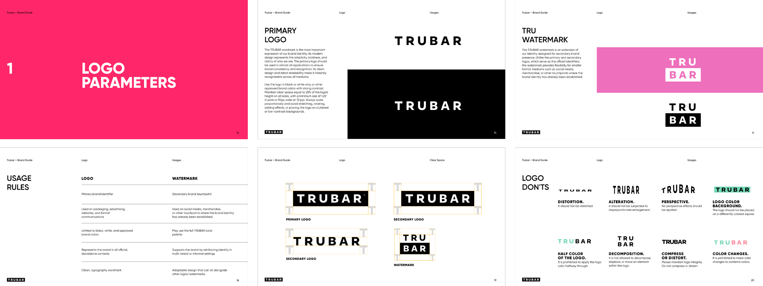
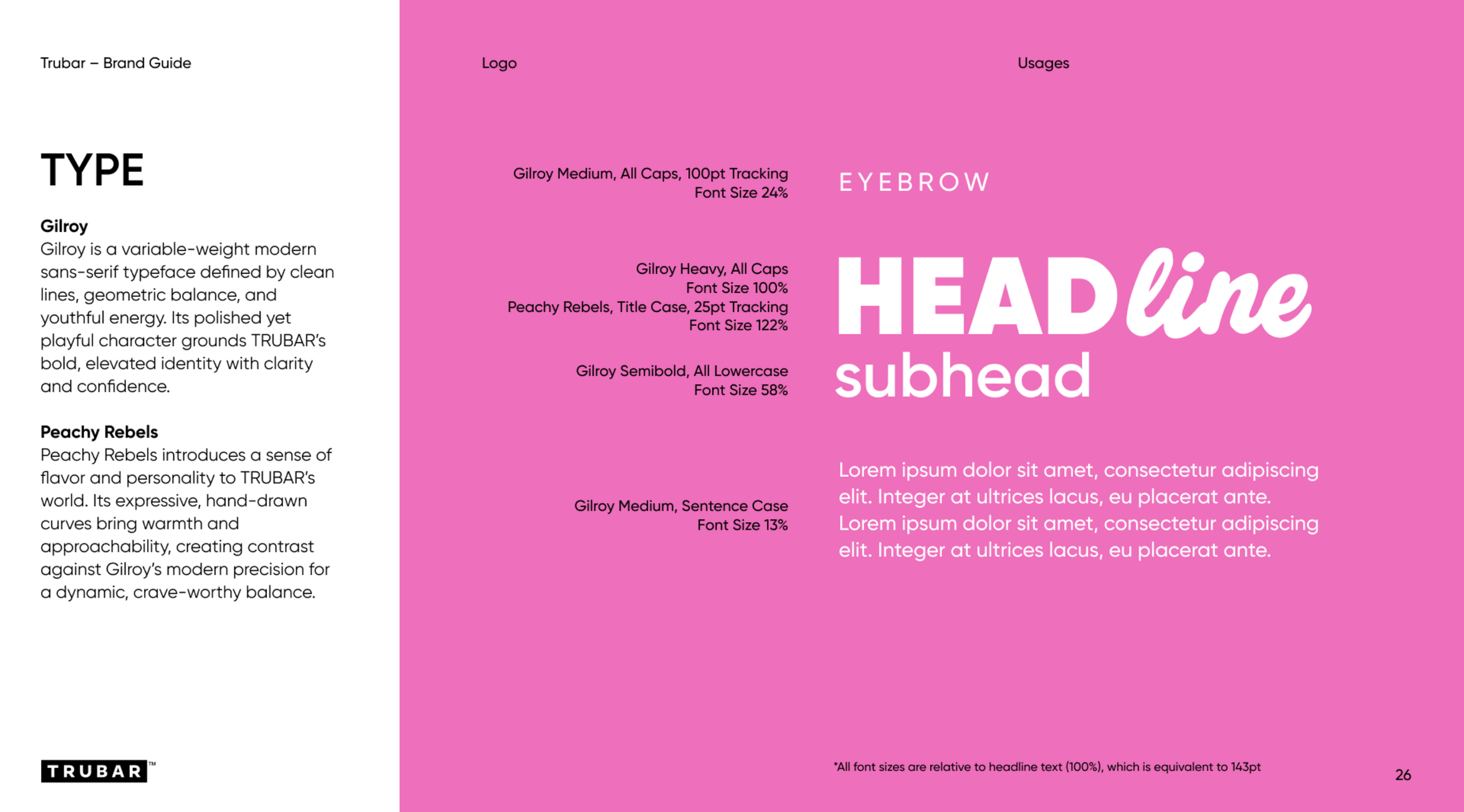
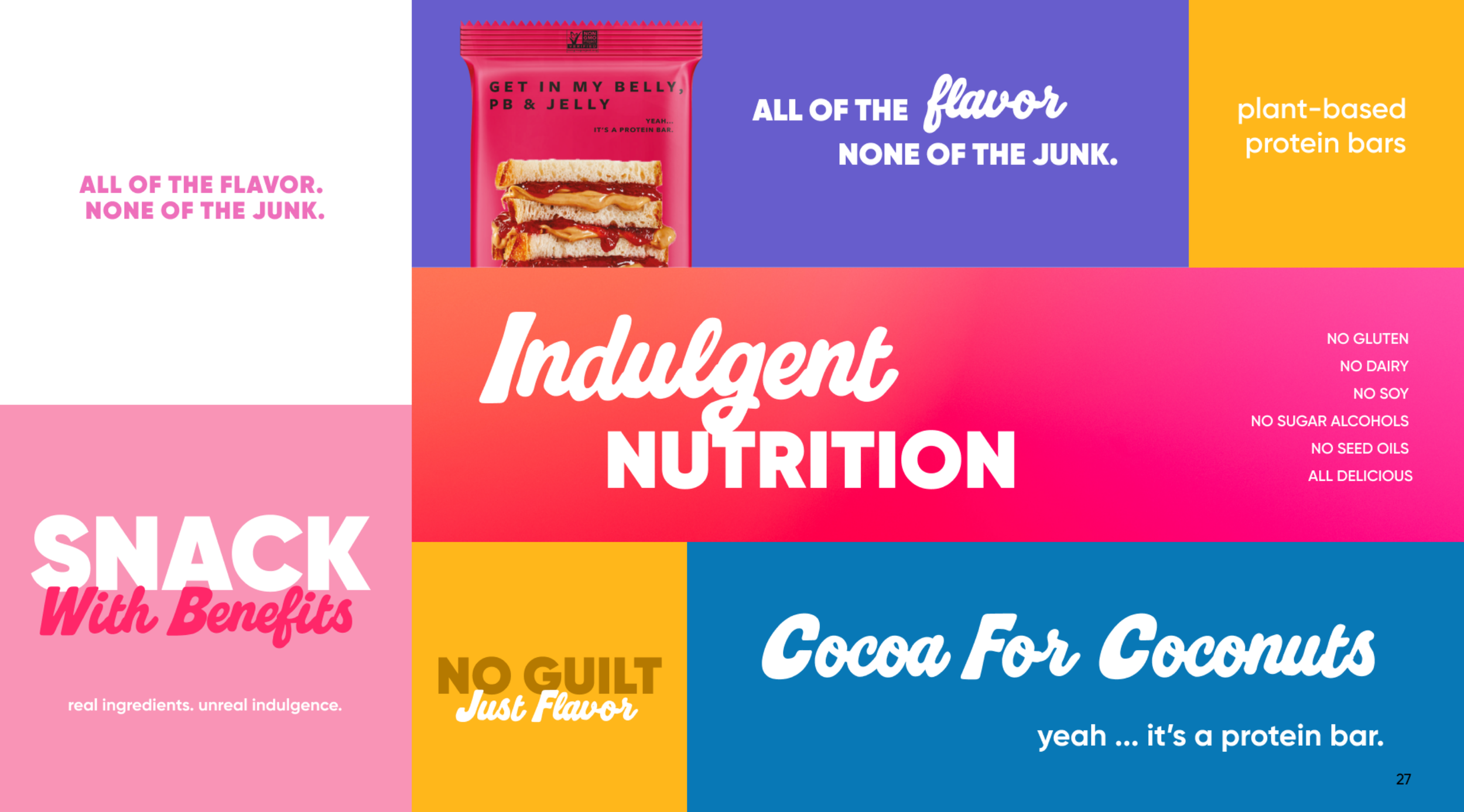
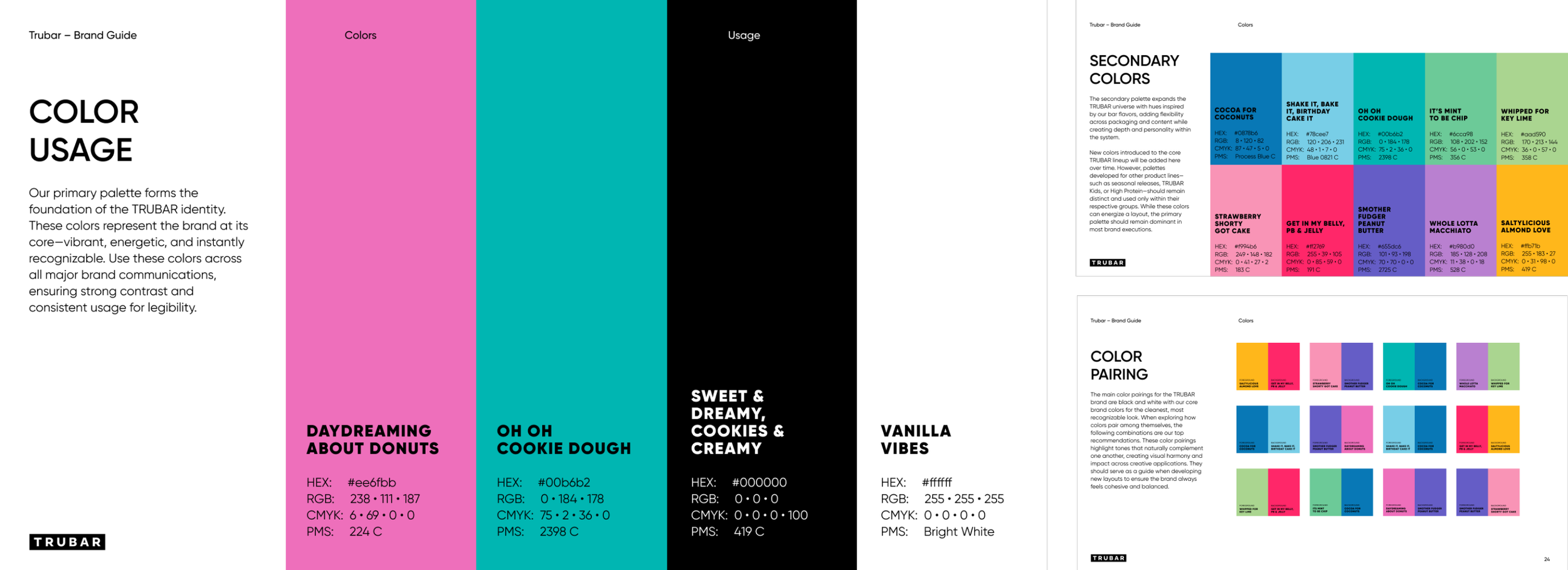
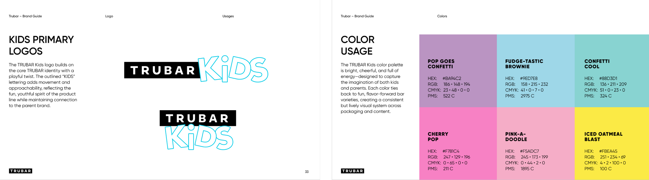
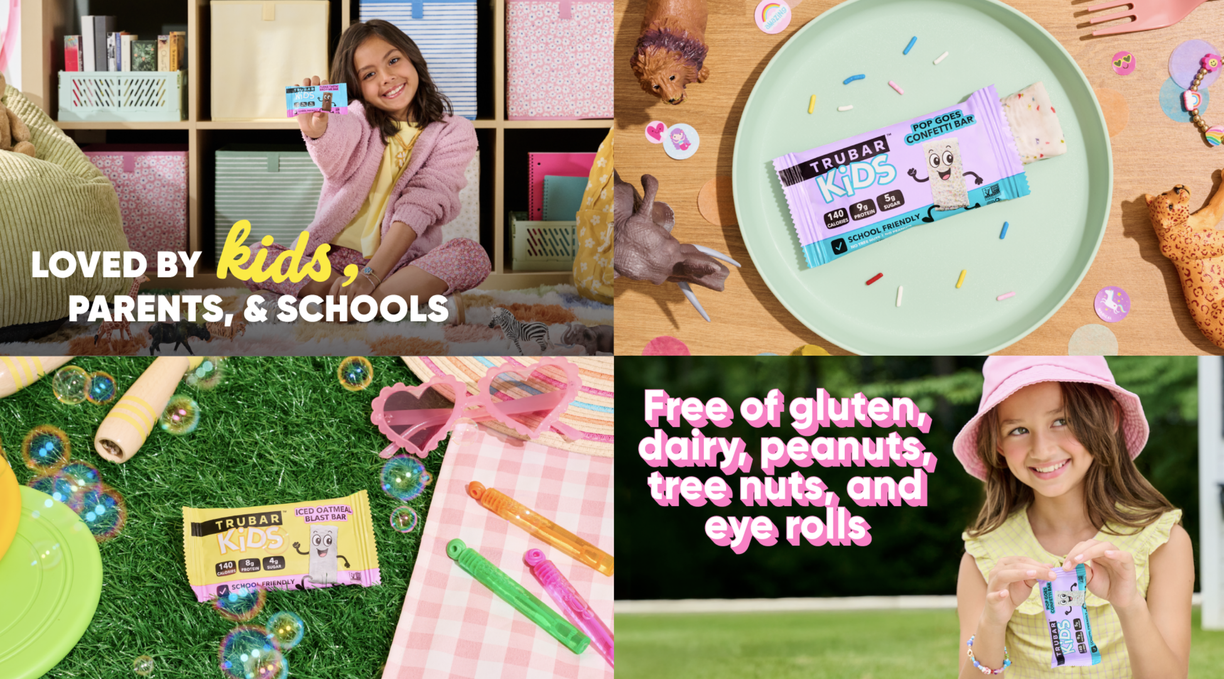
Starting with an exploration of TRUBAR's positioning and personality, we then established guidelines for logo usage, introduced a typography system, and defined a signature color palette inspired by their vibrant protein bar packaging. We also brought in playful graphic elements, photography from our latest shoots, and created an identity for their new TRUBAR Kids line. From there, we explored how all these pieces could work together, creating a brand guide that gave TRUBAR the structure to stay consistent and the flexibility to keep things fun as they evolve.


MADE WITH:
CD & Copywriter: Brandon Friedman
ACD: Joseph Ladd
Designer: Marcelo Segovia